
I like PlantUML and the whole diagrams-as-code ethos, where diagrams auto-generate from source code in the same repo.
Sure, the way PlantUML lays out objects and lines in free-form diagrams is arcane – try drawing anything beyond a few components, and you’ll end up in a pitched battle with the layout engine, resulting in a mediocre diagram in a state where you’re afraid to make changes, lest the lines and placement go all wonky (again).
Thankfully, things are better when using PlantUML to produce opinionated diagram types, where the layout rules are predetermined, such as sequence diagrams, mind maps etc.
I got to thinking – could I use PlantUML in the workplace, outside traditional architecture/code documentation, to help visualise other things? Only one thing for it – give it a go…
(scroll up for top of post)
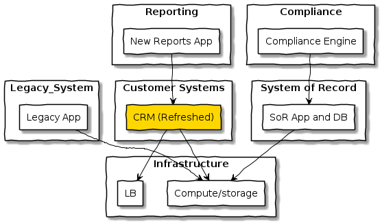
Free-Form Concept Diagram
When a colleague asked for help visualising a concept, I live drew it with him in PlantUML using rectangles and connecting lines. It looked something like this (anonymised, so don’t read anything into the labels):
(source)
My colleague seemed impressed – coding the boxes and relationships was relatively easy and simple to modify (barring the layout issues mentioned previously). This exercise highlighted to me the need to start with a good template. PlantUML syntax isn’t easy – it differs per diagram type, and a lot of time can be wasted searching for examples when you’re trying to start a diagram from scratch. This diagram used code from a previous blog post as a starting point, and that saved a lot of time.
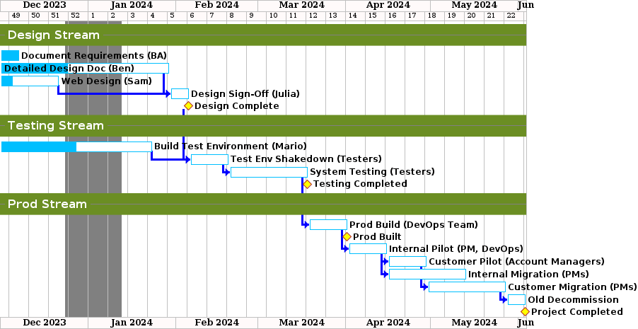
Gantt Chart
I hit PlantUML again when I needed a Gantt chart to demonstrate a rough plan for a project I was advocating. I’m an IT architect, not a project manager, so I don’t have ‘proper’ planning tools like Microsoft Project. Previously, I’d drawn colourful Gantt-like diagrams in Visio. They were well received by their intended audience (senior managers), but when it came time to change tasks, adjust time-frames etc. to true it up with actual progress things got difficult. Much time was wasted manually moving boxes and dependency lines. This time I used the Gantt chart (diagram) feature of PlantUML instead.
Here’s an anonymised version similar to what I drew:
(source)
PlantUML does the visualisation, so changing dates, durations, completion percentages etc. is a breeze – just update things in the code and the chart redraws. Magic!
For example, change the start date in this line of code and everything updates:

There is also a resource tracking feature, however I found it a bit clunky, so didn’t use it. Instead, I added the resources to the title of the task and created an abstract name for the task that doesn’t change and break other references. Example:

Here we create a task that is labelled as “Design Sign-Off (Julia)” then give it a reference “design-signoff” that we use elsewhere without worrying about breaking things if we need to update the resources in the task name. The “starts after” creates a dependency on the reference to another task and the “0% completed” colours the task with a percentage completed bar. The second line creates a second dependency on another task.
While it’s not a replacement for a full-featured project management tool, it is simple to use and free. Once I created a working template with styling that suitable aesthetic, the rest was easy.
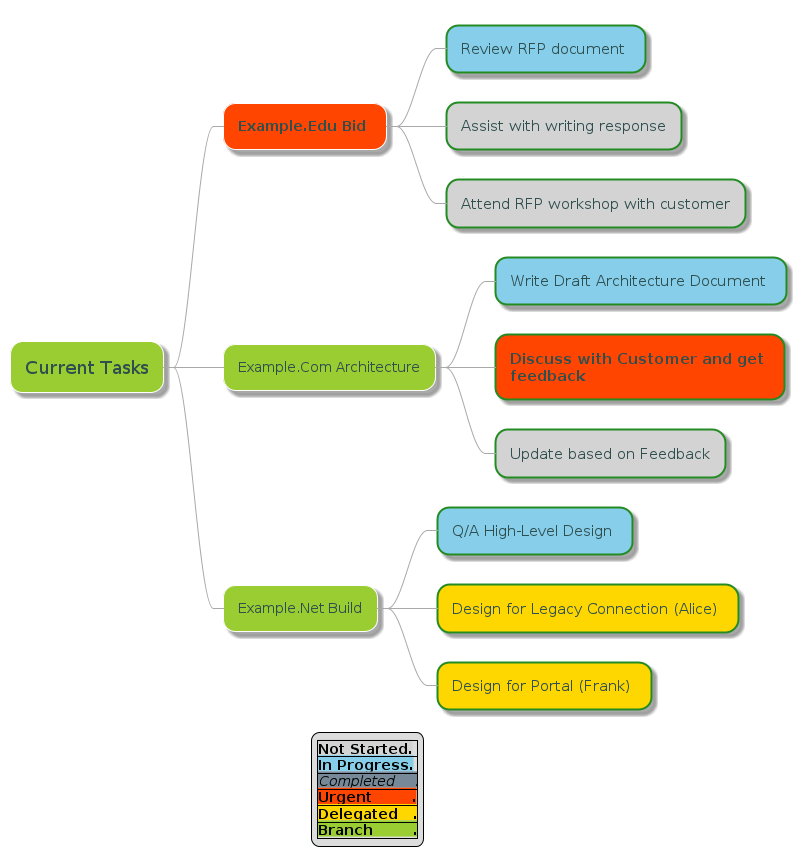
Tasks Map
Both the rectangle and Gantt uses were okay, but where I really hit paydirt was using PlantUML mind map feature to produce diagrams of tasks I’m working on, so various managers I work with could understand my workload, and negotiate on priorities.
Here is an anonymised tasks map:
(source)
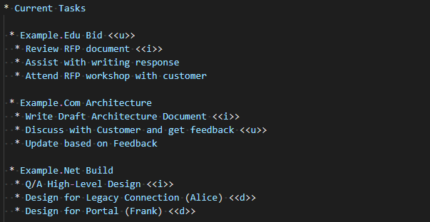
While a simple list-based approach might suffice, this mind map structure adds value by grouping related tasks and colouring by status, both of which aid comprehension. I’m sure there’s an app for this, but I prefer this approach as I’m in control and it’s open source. The code for the tasks is very simple, using indentation for levels, and style decorators to add status to tasks (example: <<u>> styles a task as urgent)
The visualisation helped with discussions on delegating tasks to reduce my workload, tracking what I’ve delegated, and what needs working on next. It does require regular maintenance, but at least it’s now an easy and quick task.
Wrapping Up
So, is PlantUML useful elsewhere in the workplace? That depends on what you do and how you like to work. I’m the kind of person who values being able to structure ideas and visualise them, so I’ve found this experiment useful. Using PlantUML to draw my tasks was a win, so I’m definitely going to keep doing that.
Having PlantUML templates is also useful – I’m slowly building a repo on GitHub with example diagrams at https://github.com/mattjhayes/PlantUML-Examples to cater for common scenarios.
Reach out if you have your own PlantUML templates that you’d like to share.
